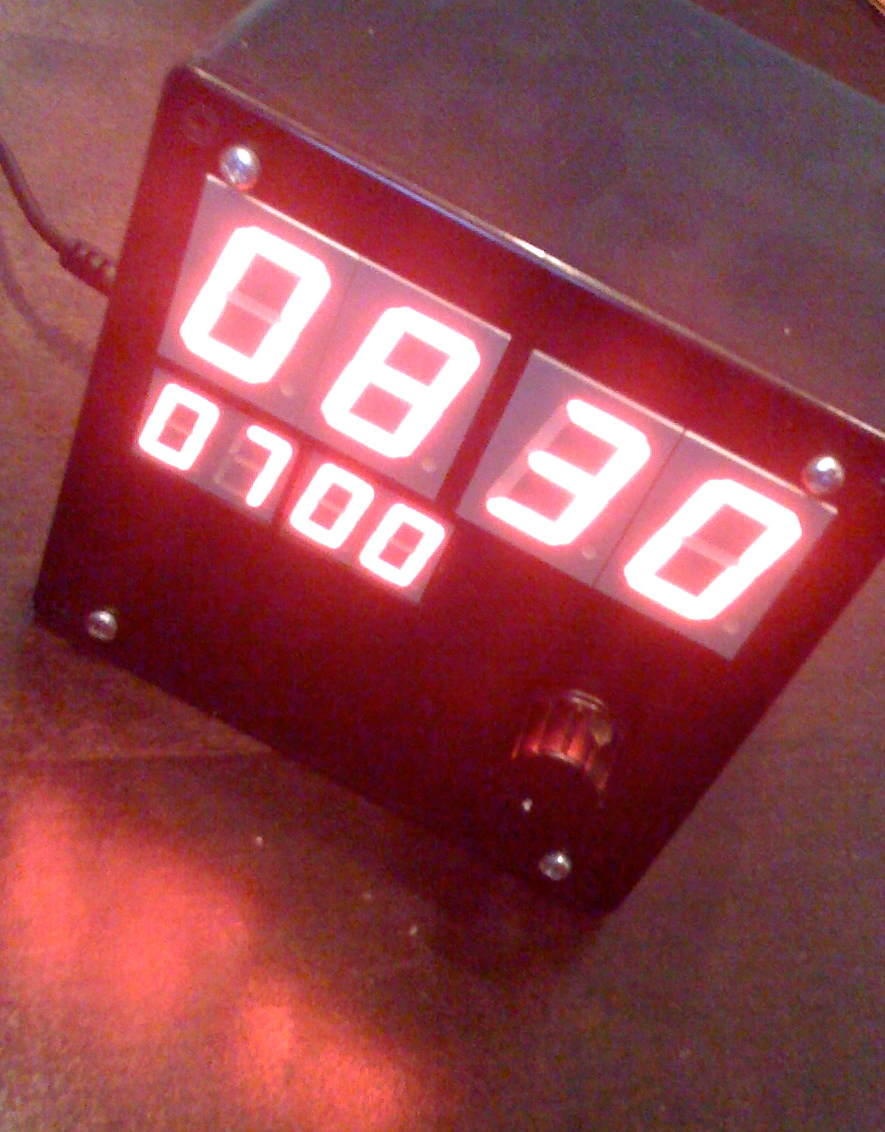
The Clock: An Experiment In Personalized Time Appliances
Prof. Jan Borchers
In 2009, we decided to throw out our bedside alarm clock due to its terrible usability: With frightening regularity, its alarm would get armed accidentally when picking it up for cleaning, leading to unwanted early-morning wakeup calls on weekend days.
A trip to the local consumer electronics store was depressing. Maybe it's the usability education, but it felt as if all the alarm clocks on the shelves were designed as terrifying examples of bad user interfaces. Rows of tiny, identical buttons, near-invisible indicators whether the alarm was on or off and the choice between bad radio reception and a bone-marring buzzer were just the beginning.
But there's something good behind this story: Enraged by this assembly of usability faux-pas, I decided to roll my own. The result: The Clock. It does exactly what we needed, in exactly the way we wanted it to, with a user interface that you will find too good to be true once you've tried it. And being the perfect birthday present helped greatly to establish the firm deadline needed to actually finish any project like this.
More on its ruthlessly user-centric design process and resulting features and interface later. For now, here's a picture.


