Pipes Interaction Principles
This week's task is to determine the rules for interacting with the game: how selection is handeled, which gestures will be utilized, etc.
1. Highlighted and Limited Selection
To cope with the difficulty of the complex 3D space, we want to limit the user to only a few choices. The first choice the user has to make is where to place his piece of pipe. To make interaction manageble we are going do disallow free placement and only offer predefined positions, namely the open ends of the players pipe system. These places should be highlighted in a way that even currently hidden open ends get noticed.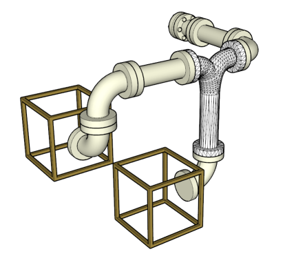
2. Point and Click to select
The most basic method make a selection from a limited amound of choices is point and click. We want to use this to let the user choose his building location. This will be a hard part implementation wise due to the dynamic perspective. The selected grid will be highlighted to make the selection obvious: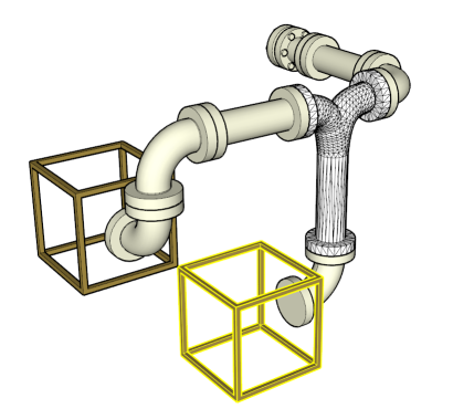
3. Automatic Connection
To further assist the user and avoid error, his chosen pipe will be automatically placed in a way such that it connects to the open end. This will limit the possible rotations significantly.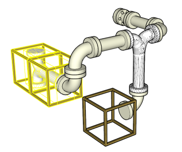
4. Changing Connection
For parts with more than two ends, this brings up the new problem of which end to connect. We want to offer the user the chance to change the way his pipe connects. We have chosen a 2-fingered turn gesture for that.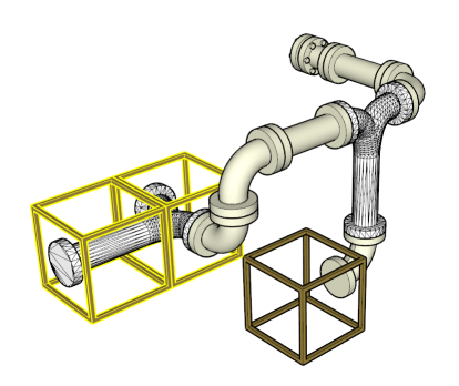
5. Changing Rotation
Once the connection is chosen, the user must be able to rotate the pipe. Because the connector choice is detached from this process, we only have 4 choices in two dimensions left. to do this change, we want to use a one point turn gesture, meaning drawing one finger in a circle.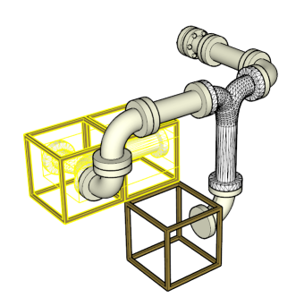
Implementation point and click
Implementing a point and click interface in a 3D environment is a considerable challenge. When a click is performed on the 2D surface, it translates into an undirected point on the front side of the 3D space. What we like to do is to cast a ray from the this point into the scene, but where do we get the information of the direction? The option of casting a ray orthogonal to the table surface would be unnatural, especially since the perspective is dynamic. This leaves us with the option of using the viewpoint (the users head position) as origin for the selection ray, casting a straight line through the touch point into the scene.
In theory we got the necessary data to handle this quite easily. As we do not leave the perspective projection to OpenGL, but rather calculate the matrices ourselves, we can use this matrix to convert a 3D coordinate into a point on the display grid. What our custom projection matrix does is, it transforms the trapeze shaped natural view volume into a box shape, so OpenGL
is left only with a parallel projection on normalized coordinates. That means, multiplying an objects position (extended by a w-coordinate) with our projection matrix gives is the position inside the view box. Cutting the z- and w-coordinate leaves us with the position on the screen in an interval of -1;1 in both x- and y-direction. With that position given, we can measure the distance of each objects projection to the touch and select the closest one. All thats left to do is an additional distance check since even occluded objects collide with the selection ray. We can use the previously cut z coordinate to do this. Additionally we can use the z-depth to put the rays real distance to the object into perspective, meaning: the farther to object is away, the more more significant is the projected distance to the touch.
Final Changes
Because the user tests suggested that our interaction model lacks intuitivity and consistency, the model finally implemented differs greatly from the one described above. We decided to not differentiate the actions performed on the pipe, instead just do rotation, independent from the notion of being conencted or not. We now manipulate not the pipe, but the front face of the pipe containing cube, rotating up, down, left, or right by simple swipe gestures. That sometimes creates the need for more gestures than in the old model, but we, and our users, deem it generally more intuitive.

