Geo-Sociograms
Geo-sociograms are a simple way to visualize location-data of multiple people over time at a glance.
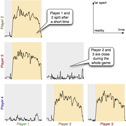
Instead of showing coordinates directly, we calculate the distance between members of a group and plot these over time. This, of course, sacrifices information about the actual topology of the area where the location-data was recorded, but helps to understand how people relate to each other in the context of a location-based application. We can see who stays close with who and how groups, for example, split up under certain conditions.
In many location-based applications, changes in latitude and longitude are measured over time. People move from place to place, depending on the scenario they might move together, follow each other or split up. The interesting question is often what kind of influence yields what kind of movement. In real-world applications there are a lot of confounding variables hard to identify, so we need tools to visualize the collected data to get first insights and formulate hypotheses.
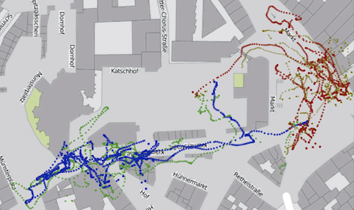
The easiest way to do so would be to plot the coordinates on a map, to see where people went (see image on the right). A problem with this is that we easily lose the dimension of time while doing so. On a static map, paths might cross each other and it is hard to see who went where when. Using several images up to video animation can be problematic because of the duration of movement as well. Besides, we run into similar problems as with video annotation.
Geo-sociograms are not meant to replace a detailed analysis of where people went go. Using the distance and neglecting the actual coordinates makes it impossible to figure out whether, for example, a specific location has an impact on a certain movement. Their purpose is to see connecting and disconnecting of users, formation of subgroups and so on. The benefit of this is not just potential new insights in group dynamics, but also a substantial improvement in terms of analysis efficiency. Since we visualize distance over time, we can see the entire duration of the recording at a glance, identify trends and so on. Coming to similar insights with video analysis of the data would require to meticulously watch the entire recording like a video, which is very time-consuming.
The concept of geo-sociograms was shown at CHI 2013, see the Paper.
There's also a Video in which Gero explains the concept in brief words, it's here.
The basic idea for geo-sociograms was first used and developed in Carl Huch's diploma thesis