Looking Through Time
Motivation
Starting with Augmented Reality applications utilizing obtrusive head-mounted display techniques, in recent years mobile handheld AR systems realized on mobile devices have become increasingly popular. Two exemplary AR projects in the cultural heritage domain implementing 3D reconstructions of ancient buildings are the HMD-based ARCHEOGUIDE and a recent iPhone application from Fraunhofer IGD. Both projects focus on technical rather than usability aspects.
In “Looking Through Time” we overcome this limitation through an iterative design process. We want to examine design issues that inform the design of a handheld tourist system providing historical information via AR. To handle technical limitations like tracking issues we utilize Wizard of Oz techniques.
User Interviews
Storyboards
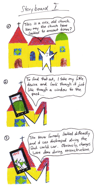 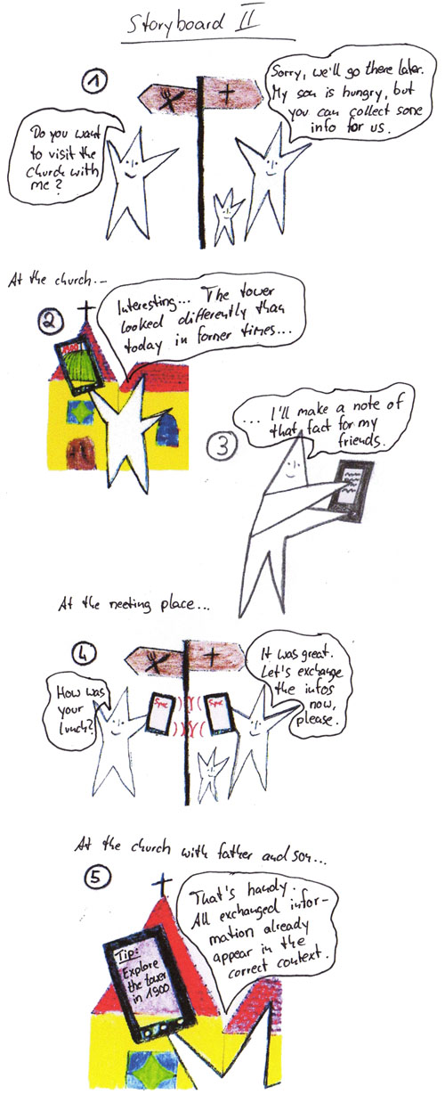 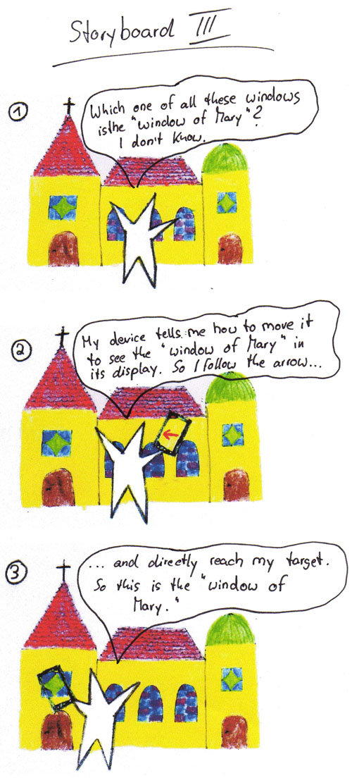 |
|---|
Interviews
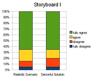
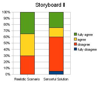
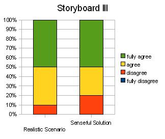
Exemplarily for our system’s target group we interviewed 20 tourists visiting Aachen, Germany at town hall and Katschhof, a square in front of Aachen Cathedral. The goal of the interview was to extract the main interests and activities of cultural tourists in before-travel, during-travel, and post-travel stages. Finally, the tourists were presented with three storyboards sketching some feature ideas for the final system and were asked to evaluate them. Feature ideas included a 3D reconstruction showing a sight in the past (Storyboard I), a way for creating and exchanging notes on a sight (Storyboard II), and a navigation aid for site exploration (Storyboard III).
Evaluation
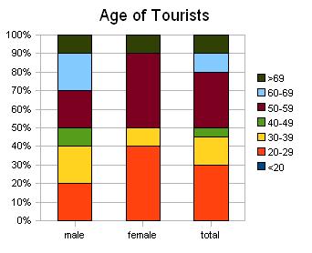
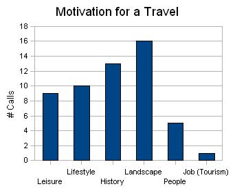
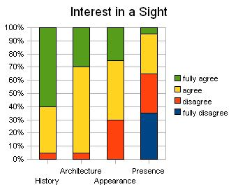
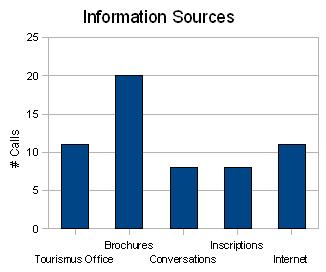
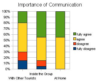
Basically, the interview indicates that the target group consists of people with different ages (from 23 to 71 years; median 55 years) and different computer experiences. Most tourists state that for them an important motivation for a travel is to learn about the history or architectural character of a site. They confirm that they collect a lot of information about the location from different sources (e.g., internet or brochures) at home before travel, but on site there is still information to be discovered (e.g., tourist office or conversations). The participants agreed that gathering and linking information of interest to gain new knowledge is simple. However, they do not fully agree, so there is still potential to simplify the process. Other comments show that for some tourists the hunt for information is like a treasure hunt and a part of the whole experience. Personal notations to document individual ideas are rarely done. Two tourists indicate to augment brochures with personal notations and two tourists state to keep a travel diary. During the stay at a sight tourists prefer to discover the sight in small groups and to share the experience with each other.
 |  |  |
|---|---|---|
 |
 |
 |
Regarding the storyboards, storyboard I and storyboard III were evaluated best, where 80% of the interviewees agreed or fully agreed the ideas to be realistic scenarios and solutions. In contrast, the feature to make personal notations in the system was mostly rejected.
 |  |  |
|---|
1st Iteration
Paper Prototype
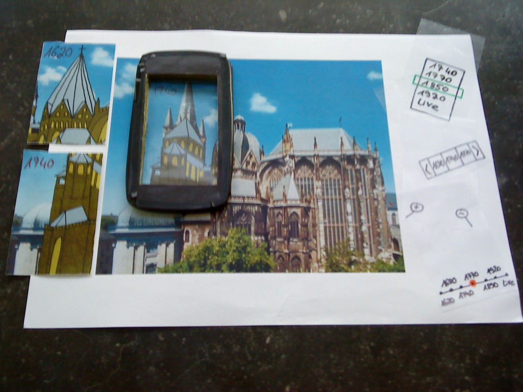
The next step was to create a first prototype to start the iteration cycle. In AR, the utilization of paper prototypes is comparatively rare. In contrast to classical desktop applications, AR applications are more dynamic, have a continuous number of views, and provide an interface with 3D characteristics. Paper prototypes can hardly mirror these aspects of AR, thus usually even early AR prototypes are realized on a higher level of fidelity. But this complicates the process of competitive design since the system is already quite concrete and modifications are hard to implement. Keeping in mind the limitations of a paper prototype in the AR context, we think that there are still a lot of design issues that can be successfully highlighted in user tests based on this form of prototyping. E.g., the adequacy of classical UI elements to control the system can be discussed and basic navigation techniques can still be performed and observed, although immediate feedback is missing. Based on these ideas we implemented a paper prototype of the following form. As reality context we take a poster of Aachen Cathedral. The handheld device is built in the shape of an Apple iPhone, where the display is a transparent case. We make use of the magic lens metaphor, so once the device is located at predefined viewpoints at the poster a corresponding inlay is inserted to the case. The same holds for transparent inlays representing interface elements when the user executes certain interactions.
User Tests
Four different user tests with different foci were performed. Eight users performed each test; three users had an HCI background:
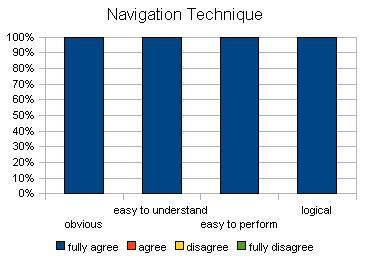
- In the x/y navigation task the user is mainly asked to bring different elements of Aachen Cathedral into the device focus and to evaluate the usability of the navigation technique utilized. Additionally, the user is asked to bring each part of Aachen Cathedral into the handheld’s focus at least once regarding different poster sizes and to evaluate the workload. Finally, the user is presented with different suggested optical interrelations between the display view and the surrounding reality and asked to evaluate them.
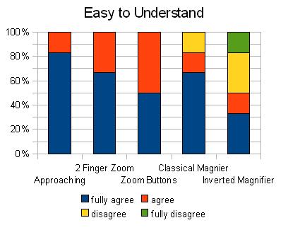
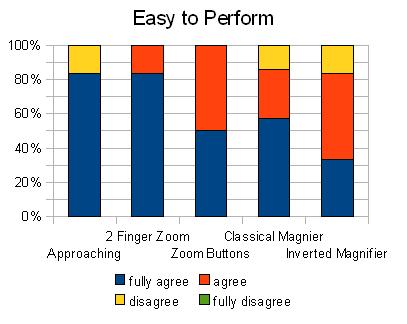
- The z navigation task suggests different zoom interaction techniques. The user is asked to zoom in and out at predefined viewpoints and to evaluate both the usability of the different presented zoom techniques and the quality of the emerging optical interrelation between the display view and the surrounding reality.
- The time selection task focuses on the filter technique to directly select an epoch the digital augmentation is related to. The user is asked to solve different selection tasks at predefined viewpoints utilizing competitive interaction techniques and to evaluate the techniques.
- The time search task is similar to the time selection task, but the time to be selected is not given. Instead, each task is to find a certain epoch in which Aachen Cathedral had a given look.
Evaluation
Spatial Navigation
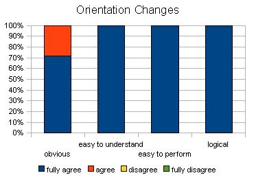
The user tests have shown that the magic lens metaphor is easily understood and utilized by the users. While focusing on a certain target in reality, the user tends to completely bring this target into the display, which includes changes from horizontal to vertical orientation and vice versa. Implemented interfaces should ideally support both horizontal and vertical device orientation.
 |  |
|---|
Zoom
When the size of a target object in reality is very large compared to the display size, focusing this object becomes uncomfortable. One way to compensate for that is to scale down the perceived object’s size by increasing the distance to it. This action is natural and readily adopted by users. However, one criticism is that this action is not always possible and can hardly be done without automatically changing the perspective. A solution is to keep up the digital zoom functionality already implemented in the interface that allows changing perceived sizes while keeping the position.
 |  |
|---|
As interaction technique for digital zooming, users prefer dedicated buttons with +/- zoom functionality extended by the two-finger zoom technique as macro.
Time Filter
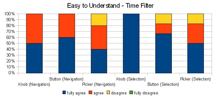
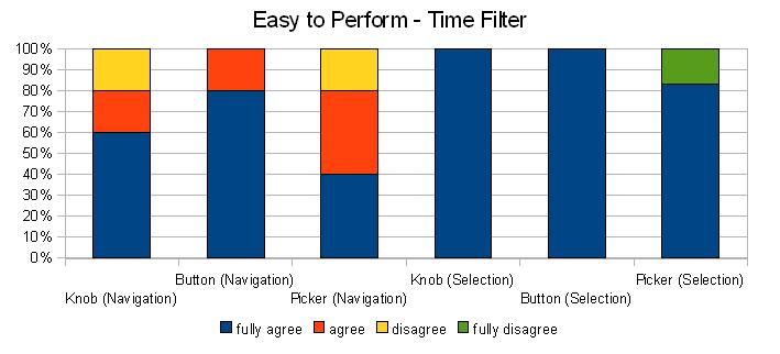
The evaluation of the time filter techniques was similar for time selection and time search tasks. One reason for this is that the time search task was frequently reduced to a direct selection task with interval search.
 |  |
|---|
The preferred interaction technique is a dual physical knob (like the volume changer on the Apple iPhone) to increase and decrease the selected time. Additionally, for direct selection of a certain time users wish the displayed feedback element to be a touchable control.
Optical Interrelations
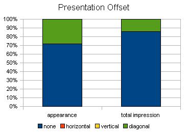
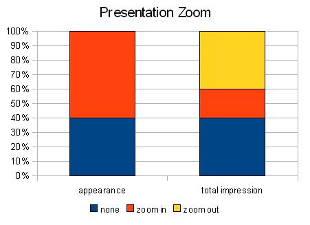
The evaluations regarding optical interrelation options between reality and handheld display show the users’ affinity to a central display view with a natural zoom factor to optimally integrate the display’s 2D projection to the total view. These findings can be considered as first orientation ideas, however they clearly have to be rechecked in the next iterations comprising more realistic distances and approaching a 3D reality.
 |  |
|---|
2nd Prototype
Outlook
The next step is to realize our findings in a higher-fidelity prototype and to deepen our understanding with another iteration. The idea is to implement this prototype on an Apple iPod Touch. To save us from a picture-based tracking module, the tracking is done by a Vicon Tracking System. Vicon can also record a user’s navigation for further investigation of correlations between a user’s target and his actions while getting there. For any handheld’s view on the poster its screen is filled with the corresponding clipping of the poster graphic augmented by the respective clipping of the currently selected augmentation layer. This gives us full control on the presentation ignoring camera restrictions and allows us to simulate different camera types. Unlike the paper prototype, where the focus was on the interaction, the second prototype tackles presentation issues. This includes a competitive comparison between different animation techniques for augmentation changes and the question how to realize a 3D deconstruction to deal with buildings that have grown over time instead of being ruined.

