Physical Data Visualization
This page is part of the MCP 2013/14 class. It was supervised by René Bohne.Abstract
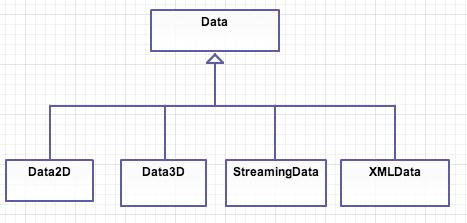
The main objective of this project is to create a framework and software utilities for the users and developers to enrich the data visualization. Data is visualized in different
forms on the users screen like 2D, 3D visualization. Visualizations(Vis) created by these utility softwares generates output that can be readily used with 3D printers
and Laser cutting devices. This project mainly focuses on Music and GeoData Visualization, where music and geo data is brought to life in the form of real 2D and 3D objects.
Project also focuses on "Internet of things" where data can be collected in real time using various web services like smartcitizen API, Google web services, Twitter services and is mapped to visualization. Users are not only restricted to online data, even offline data can be used for the same purpose. This gives an opportunity for the enthusiasts , developers and artists to come up with new ways of projecting their ideas and creativity. A 3D model of music visualization is shown below.

Related Work
Physical data visualization(PhyDataVis) is different than the traditional way of visualizing data on the screen. There are powerful tools available to manipulate data in real time and visualize them on screen, but in contrast physical data visualization(DataVis) is quite difficult to achieve and involves lot of process. Primarily, physical visualizations are static but things are becoming more dynamic in recent years. This is becoming possible because of new and improved techniques like digital fabrication and increase in research of tangible computing.
PhyDataVis is defined as visualizations that are made of physical matter unlike visualization on computer screens. Data sculptures are increasingly becoming popular, where
data is consumed in some form and a sculpture is created in a real world. This type of visualization conveys message more than the data. It gives a global perspective on
the data and gives user a new, intuitive and engaging experience.
Traditional vis are mainly used by experts and performance of the vis, whereas casual visualization is mainly for large audience and not for work areas.
Some PhyVis have parts which are movable and can be rearranged by user. Example, Lego block visualizations.
There was even a evaluation of 3D data models with equivalent of on screen representation. Study was conducted to assess spatial memory and item retrieval tasks.
2D representation was by far the best to understand easily, but 3D model in real world performed much better and clear to understand than 3D model presented on screen.
It is show in the paper \cite{} that even passive physical visualization is useful and building them using new devices like 3D printers and and laser cutting tools can be appropriate for both research and personal use.
Tools, Libraries and Services
To accomplish this project we used various tools, libraries and web services, some of important components are mentioned here.
Physical Printing:
DIY MakerBot CupCake CNC.
Professional 3D Printer Dimension Elite.
Lasercutter.
WebServices:
Echonest http://echonest.com/ Google Panoramio http://www.panoramio.com/api/widget/api.html Twitter services wrapper library, Twitter4J http://twitter4j.org/en/index.html
SDKs:
Processing http://processing.org/ Eclipse https://www.eclipse.org/
Software tools:
Visicut https://hci.rwth-aachen.de/visicut Pleasent 3D http://www.pleasantsoftware.com/developer/pleasant3d/
Music Visualization
In this project visualization of Music is done in 2 ways.
- 2D visualization of music.
- 3D visualization of music.
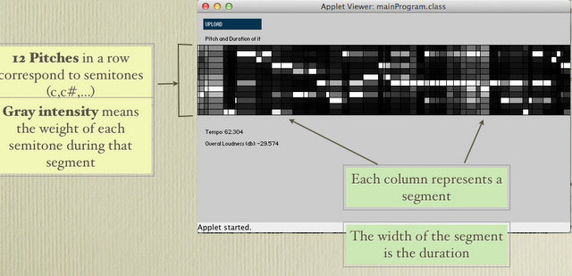
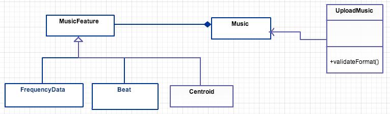
In this approach music data like .mp3, .wav file is used as an input. Music data is analysed and different parameters in the music is found and used for visualization. Initially, features from music data such as tempo, bass, pitch, tones and few others are extracted to create different kinds of graphic outputs from the music files which is played. To handle different situation and steps involved for analysing the music to visualizing it , a framework was planned and developed as a result.
A pipeline in the production of these visualizations is shown below.

Many experiments and research were made, main source of our research was to understand different types of visualizations. We looked into lot of examples in open source community like http://www.openprocessing.org
2D Visualization experiments:
The initial test was to use the framework we proposed to extract some features out of the music files, and analyse what data we could get out of it. With these information we got a global idea of what material could we work with and take that as a starting point for the work to come.
With this in mind the first iteration was to process some features out of a music file to create graphical data out of it , these being:
1. FFT
2. Level
3. Centroid
4. Logarithm Average of Frequencies
2D Music and Physical visualization:
After initial experiments, the next steps were more oriented into making visualization that can be used by laser cutter and real world object can be created out of it. Given this we proceed to find shapes and figures that were feasible for being made into physical objects. Grinding through ideas and concepts on how to create this, we iterated over this steps using the data we processed from music files, given the following results.
For this prototype, the music features were drawn in a circular shape with different colours and values depending on the features that were extracted from the music file. This shape could be translated into an SVG file which can be printed using a laser cutter in the fab lab.

Challenges
- We found that text tag in svg format was not supported by Laser Cutter, so we in order to make it works, we decide to transform each letter into a path which is printable by the machine.
- Also we found that using VisiCut was necessary to give more feedback about the layers e.g. which one has to be engraved or cut. So we add colors to the svg file in order to be easy to recognize using VisiCut software, this is one example:

The green lines are meant to cut and the red lines are meant to engrave.
Doing this we could cut many 2d visualization very easy:

3D Music visualization experiments:
The first attempt in 3D visualization of music was to create a sample mesh, which used the music data as an input and drew a random 3D mesh out of it.
This was used for testing, trying to get some inspiration and to understand what we can visualize with this project.

We did different experiments with 3D visualisation. A major idea behind visualisation was to make a meaning out of the model. Though it is difficult to come up with a static model which makes instant meaning, we tried to create a model which makes sense without any initial labelling and easy to understand.
Music features out of the music data is extracted like kick, snare and hat parameters. Minim library is used to extract these features which comes bundled with Processing SDK. Whenever above parameters are detected a peak is formed on the surface. This is done in real time, whenever the buffered music data is read and interested parameters are detected it is immediately visualised on screen.
The final objective was to create an artistic real world of music, where music one listens is perceived in a real world object.
In the above implementation, the distance between the points is customisable and one can create an artistic sculpture out of it.
This is mainly inspired by a technique called "Augmented sculpture". If one projects a light on to the model created above it creates a kind
of shadow on the wall or opaque object. This creates an illusion in the users mind where real world points and shadow points are merged as one.
A similar example was demonstrated here, https://vimeo.com/84027499
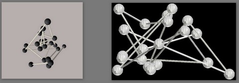
Figure on the left shows the visualisation done using processing and on the right, shows the vertex calculated from STL file.
Unfortunately, to convert this into a physical object posed a lot of challenges. 3D printers take STL files as input and in the above sketch spheres and cylinders were
drawn using high level library objects and recovering a complete connected vertex set for STL file was not possible with this approach.
In the next round of iteration, to improve the 3D visualisation of music and to make the process more generic and 3D printable another approach was taken.
To build a 3D model, a solid base is required, we provided one. On this solid base music visualisation is done. This was initially done randomly on a base and was experimented in MakerBot 3D printer. Result of the same in the figure 1, where pole represents the musical beats.
Showing the poles randomly on the base, kept a sort of surprise element at the end, but user had no idea of the outcome. To improvise on this idea, we allowed
this framework to take a pre set of parametric equations. As a developer, one can write a plugin to this framework and create different designs on the base which
end users can use to create their own music visualisation.
Example, A parametric equation of a circle can be plugged into the framework and when a beat is detected, it can be snare, kick or hat, a pole is generated at that point.
Height of the pole depends on the type of parameter, in this way height of the poles indicates to the user in the real world about the parameter of the music.
This also gives an opportunity to represent music in a mathematica and artistic way. The outcome of the design of the model remains mystery till the end.
Only thing which user can be sure of, is the boundary of the designs and rest of the outcome is left to algorithmic design. Below figure shows the 3D visualisation of music
in the boundary of circle with radius of 100 units.

Parameters like height of the poles for different parameter of the music are in control of the user. More complicated and intriguing mesh can be created by the developers as plugin and can be used with our framework.
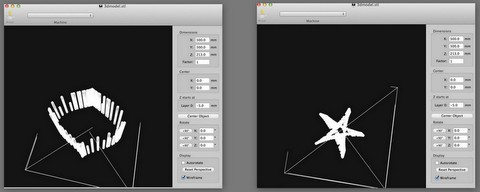
One more example of creating music visualisation from on screen to 3D model is shown below.
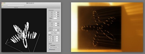
Above model is printed using professional 3D elite printer.
Visualisation Framework
As was stated in the beginning of this document the objective of this project is to build a framework that creates different printable and artistic visualisation out of different data sources, and for the creation of the framework processing the data is necessary, here we’ll walk through the process of creating this framework and how it was planned and approached during the project time. We set a initial sketch of how the framework should work for the individual parts of input data given for the project, so the same was done here in the planning of the whole visualisation framework.

Also the data utilities must be specified, because it needs to be set to ground what kind of inputs are we processing with the framework to narrow down the possibilities and make some standardised entries for the system, this also provides a controlled environment that allows different users to experiment with many files as long as is compatible.
The music analysis as complex as it is require more special attention, because of the amount of features and data we can obtain from it, so a sketch for the music visualisation framework was also done in an attempt to guide us for the construction of this framework.
Geo Data visualisation
Nowadays, it has become quite common to tag lot of online data with the geo location. In Geo data visualization we are marking all these different types of geo tagged
data to the globe which will be 3D printed at the end.
There are 2 types of data that can be mapped currently.
1. Online Data.
2. Offline Data.
Both the data should be geo-tagged, i.e. either place name/ GPS location should be present along with the information.
Online Data - This is a type of data that are collected online from different servers and webservices.
We particularly used Twitter, Google Panoramio and Smartcitizen API to map various online data.
Twitter:
Twitter is a globalized social network that allows user to post short text messages from a pc or mobile phone, but has scaled so much that we could collect a lot of social information of the whole world or of a determined region because to their geotagging functionality. This means that the data can be filtered by city, country or latitude and longitude values allowing developers to monitor a given part of the world and create whatever they want to with the fetched data from twitter.
We started this approach by something as simple as the trending topics, these are the keywords that are usually tagged with a hashtag (#) and used for search purposes or classifying a post to a determined topic or area.
Using processing libraries and the framework we created a visualization of the words that were trending in different parts of the world. This helped us test the versatility and capabilities of the Twitter API.

We created a tool, where user can easily map the twitter trending data on the globe at any point in time.
We are using Twitter4J library for querying twitter webservices. At any given time, Twitter webservice allows user to query countries which are trending and the tags/topic that are trending in that particular place. Once the trending countries are retrieved, response is parsed using JSON parser which is bundled with processing. Google geo-coding service is used to convert location information to GPS. Some of the GPS locations of the major cities are even cached, so that they don't have to be queried every time. As a free API key, there are limitations on the number of queries that can be performed by the end user. If the quota of queries are over, no more requests will be served from Twitter websevice.
The twitter API use OAuth for authenticating the user that is gathering the data and with this limit the amount of requests done per hour, it requires an OAuth API key of course but this is not a problem given that twitter trending data and topics doesn’t not change that much by the minute, it takes time before a topic is so big it actually goes into the trending list of a region.
As a further approach it was possible to use the geotagged data of twitter to create a global visualization of this in a globe, this was made as generic as possible for reusing later on, so a basic output was generated from this using twitter trends

Google Panoramio:
This is a service which accepts pictures which are geo tagged. Geotagged pictures is selected for google maps and google earth.
We utilize this information to collect user locations where he/she has travelled. All these places will be marked on globe and 3D printed.
It gives a user a way to print what he/she has previously visited.
Smartcitizen / xively API:
These are set of services which provides live information from certain devices which are installed all over the world. One can query such data and make a meaningful
interpretation of those and visualize them on globe, e.g. Most polluted countries today, Countries whose temperature is above certain level etc.
The first idea was to use the public API of Xlively, because of the amount of sensors present across the world and data offered by them. This was experimented as mini-projects in assignment “Gears” and “Gyroscope” which is shown below.
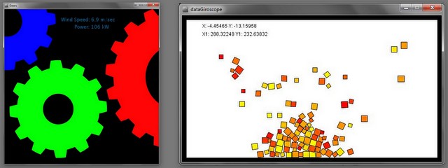
In the first image it was the Gyroscope sensor of an Ipad that connects with the Xively platform using an API key and a web request to fetch the data into processing. The second image belongs to a public sensor of a power windmill which was installed in UK. The Xively API allows gathering data from their public listed sensors and it was possible to visualise this data in processing.
As an initial idea for the project we thought it would be useful to use more of this API to make different graphical representations of data picked by different public sensors, to visualize sensor data but it was later revealed that this service may not be free for long time. After looking for other services which are free and provides similar services, we stumbled on to SmartCitizen. This was our another iteration of visualizing sensor data but from a different service.
We explored more about this API and tried working with this API from a research group in Barcelona. They provide a series of sensors made by them with Arduino technology which are placed by other University research groups from all around the world.
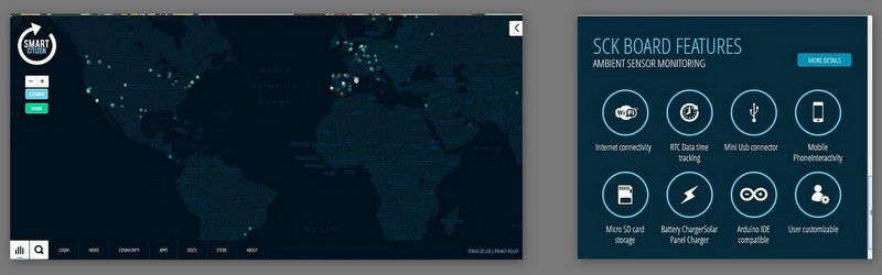
The SmartCitizen kit provided by this group gives the hardware necessary to gather sensing data in an indoor or outdoor environment with full connection capabilities and ready to place in the location desired by the participant in the project. It also allows the user to customize the kit for any activity desired to do with this project. The hardware provided is ready to go and consists of several sensors attached to the Arduino board. More information can be found at http://smartcitizen.me/
To fetch the data from this project they provide an API that allows registered users to do different HTTP request and get response data out of their platform. This API is currently in beta test state which means the functionality of this API is limited to a few requests and also requires a beta sign up registration for the use of the full API capabilities for now.
The current state of the SmartCitizen API allows us to get the full list of all the devices streaming sensing data and their locations around the world and also to get individual responses from each sensor placed of what data are they sensing. This data is returned in JSON format which Processing can handle to create different visualisations of it.
For an initial experiment we gather data from a sensor located in Paris, France, and create a simple animation out of it, using the values of the sensed data as inputs for an object for each one of them, creating an animation that shows how high is the number to make the object spin accordingly to it.

The next iteration of this part of the project would be to create a visualisation which we could print using the different tools of the fab lab in order to make physical visualisation out of it, that could bring some meaning to the data and create a nice artistic visualisation out of it.
OfflineData
User can not only mark the points on the globe using webservices, one can even map any offline data which can be tagged using place or GPS location.
User has to supply the data in pre specified format (In this case XML) and our tool parses the XML and can visualize the data on to the globe.
An example format of the offline data is shown below.
{CODE(caption="Example format for offline data")}
User Manuals
2D visualisation:
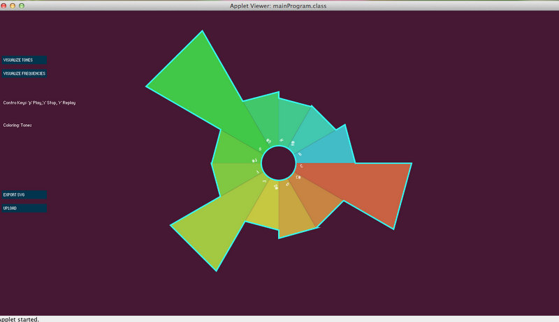
Step1: Unzip MusicVis2D.macosx.zip and run the application (it only supports mac) or you can run the Processing project MusicVis2DProcessing.zip which run in any computer. Then, Install Visicut for laser cutter.
Step2: You will see the UI as shown above, Choose the type of visulization that you like, tones or frequencies.
Step3: Load the music which you would like to visualize.
Step4: See the program in action, as you see visualization changing every frame.
Step5: Click on Export SVG to Save the frame to SVG which can be used by laser cutter.
Step6: Open the SVG in Visicut.
Step7: In Visicut, you can choose to select different layers depending on different stroke colors marked on SVG.
Step8: Choose by colour and the outer portions needs to be laser cut with power 90, while characters to print can be laser cut with much
lesser power, like power value 8.
Step 9: See the laser cutter in action and get the model after few minutes.
http://www.youtube.com/watch?v=4iMhF13AaQY
3D visualisation:
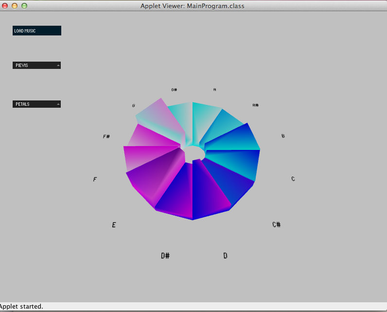
Step1: Unzip MusicVis3D.macosx.zip and run the application (it only supports mac) or you can run the Processing project MusicVis3DProcessing.zip which run in any computer. Then, Install ReplicatorG to print in 3d, more info in http://hci.rwth-aachen.de/makerbot.
Step2: You will see the UI as shown above, Choose the type of visualisation that you like to see, e.g. Pie Bar visualisation or different ones from the drop down.
Step3: Load the music which you would like to visualise.
Step4: See the program in action, as you see visualisation changing every frame in the pie bar or in the shape you choose.
Step5: Press the button "Export to STL" to save the model into STL file which can be used by 3D printers.
Step6: Open the STL file in 3D printing software, this depends on which 3D printer you are using.(Check its manual to see how to print 3Dmodels using STL files)
Step7: You will have to scale , rotate or position the 3D model as required and fit into the printing bed of the 3D printer.
Step8: Start the 3D printer and model should be ready in some time. Time depends on type of 3D printer.
Step 9: Share the STL file and model in thingiverse if you like to contribute to openscource community here http://www.thingiverse.com
GeoTagged DataVis:
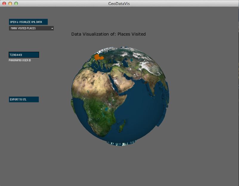
Step1: Unzip GeoDataVis.macosx.zip and run the application (it only supports mac) or you can run the Processing project GeoDataVisProcessing.zip which run in any computer that has java. Then, Install ReplicatorG for 3d printer (e.g. Makerbot) http://hci.rwth-aachen.de/makerbot. It takes some time to run because it is fetching the data from the webservices, so be patience.
Step2: You will see the UI as shown above, Choose the type of data you want to visualize, twitter trending data, Places you visited(using Google Panoramio ), Countries with high level of NO2. There is another option where you can input an xml file to visualize the data just pressing the button "Open & Visualize XML Data". The format is specify in the Offline Data section above.
Step2.a) If you choose to visualize Places you visited don't forget to fill the user id of your account in Google Panoramio, otherwise it will tell you that it cannot render any data.
Step3: Once you chose, wait for few sec to get reply from server and map on the globe.
Step4: See the program in action, You will see the GPS locations marked on the map.
Step5: Press the button "Export to STL" to save the model into STL file which can be used by 3D printers.
Step6: Open the STL file in 3D printing software, this depends on which 3D printer you are using.(Check its manual to see how to print 3Dmodels using STL files)
Step7: You will have to scale , rotate or position the 3D model as required and fit into the printing bed of the 3D printer.
Step8: Start the 3D printer and model should be ready in some time. Time depends on type of 3D printer.
Step9: Share the STL file and model in thingiverse if you like to contribute to openscource community here http://www.thingiverse.com
Challenges using 3D printers 1. 3D printers come in wide variety, from open-source to professional printers.
2. Each of them has pros and cons.
3. Open source 3D printers like Makerbot has limitation of the size, size bigger than the center, say 6 cm X 6 cm , material was not sticking to the base properly.
4. We tried various combination to hold the base, but was of little use.
5. On the other hand, Professional 3D printers prints really good models, but it is expensive and takes lot of time to print the model, In this case, it took 15 hours to print
8 cm model of globe and other 18 hours to remove support material by dipping it into liquid.
Framework Api Our project is also offered for developers, so we are providing the binaries and the source code, feel free to modify them :) .
Also we provide a developer Guide for more specifications.
Runnable applications are also available to download below.
The Framework has two versions, both run as eclipse projects, nevertheless the second edition is meant to support Processing,
we found some problems with accessing the files with java functions, so we decided to change to Processing file functions.
Enjoy our Work! and remember "Art is not meant to be useful but is necessary to enjoy the wonderful experiences in our lifes" :)