Paper
prototyping
Assignment
8
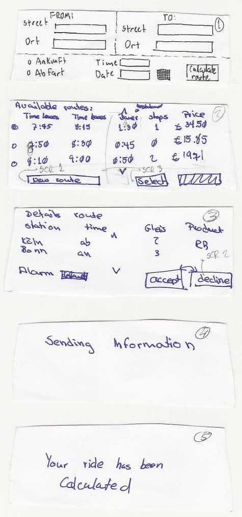
Post-It™ paper prototypes
Basic screens

|
|
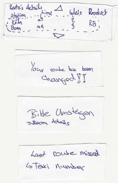
Auxiliar screens

|
Physical prototypes
Verttical layout
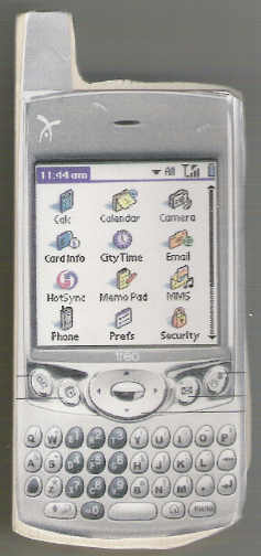
|
|
Horizontal
layout
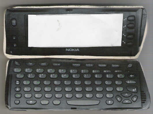
|
Results of prototype testing
Changes to the design
after prototyping experience
- Network and Batery status
icons were added on the left side of the screen
- For all the screens on the application
we add a title bar with the application's name on the left and the name
of the stage in with the user is on the right
- The calendar icon next to
the time and date boxes was taken out
- Because of the already existing
applications for this kind of devices, we changed the border of the text
box from rectangle to dotted line only on the bottom
- Bacause of the SmartPhone's features,
we took out all the buttons (including arrows) from the apllication and
use the keys provided by the device next to the screen on the rigth side
- Because of Fitt's law, we decided
to associate the most importat actions from each screen to the closer key on
the device (e.g. the
Accept and Details actions are always made by pressing
the closest key next to the screen)
- We unified the language used
in all the application
- When showing the available routes,
we add the sorting feature by different fields
Notes about the selected
device after testing results
- Both subjects did not have
a real preference for the form of the palmOne over the Communicator
- Britta
said that she did not like the format of the keyboard on the palmOne
- Both
said that they knew more people with the communicator then with the palmOne
or a similarly formatted device
- Hence along with such considerations
as that the Communicator use Symbian as their OS which is open source
it seems
that the Communicator would be the better choice for the design.
New assumptions after
testing findings
- No new assumptions were found
after the paper prototyping
